Monday 25 April 2016

Bibliography

CHESTERS, A., 2016. A Brief History of Chanel. The Guardian, 29 January

ANON., n.d. HYDRA BEAUTY - HYDRATION, PROTECTION, RADIANCE [viewed 18 February 2016]. a]. Available from: http://www.chanel.com/en_US/fragrance-beauty/hydra-beauty-130667

MICHAULT, J., G. STAIANO and NOWFASHION, 2016. Chanel-Ready-to-Wear-Spring-Summer-2016-Paris-6744.jpg [viewed 8 March 2016]. Available from: https://nowfashion.com/chanel-ready-to-wear-spring-summer-2016-paris-16504

CHANEL spring 2016 fashion show backstage ft Karl Lagerfeld, Cara Delevingne | MODTV, 2015 . YouTube

ROMANIK, R., 2009. SINGULARLY COCO: THE HOUSE OF CHANEL CONTROLS EVERY DETAIL FOR GLOBAL LAUNCHES OF CLASSIC AND REFINED PACKAGES [viewed 22 February 2016]. Available from: http://www.packagedesignmag.com/content/singularly-coco-the-house-chanel-controls-every-detail-global-launches-classic-and-refined-p

ANON., n.d. Spring Summer 2016: Backstage Beauty Bites [viewed 8 February 2016]. b]. Available from: http://www.vogue.co.uk/beauty/2015/09/14/spring-summer-2016-hair-and-make-up-backstage

ANON., 2015a. SS16: The backstage beauty report. The Telegraph, 6 October

STAFF, H.B., 2015. The History of the House of Chanel [viewed 18 February 2016]. Available from: http://www.harpersbazaar.com/fashion/designers/g3098/history-of-chanel-1213/

TALENT, V., 2013. Seven Wonders: How Coco Chanel Changed The Course of Women’s Fashion [viewed 18 February 2016]. Available from: http://www.wonderlandmagazine.com/2013/09/seven-wonders-how-coco-chanel-changed-the-course-of-womens-fashion/

TALENT, V., 2016. Chanel SS16 video campaign [viewed 20 February 2016]. Available from: http://www.wonderlandmagazine.com/2016/01/chanel-ss16-video-campaign/

TEMPLE, D., 2016. The Beauty Report. Cosmopolitan, 5 February, 165–168

ANON., n.d. The Debate: Team Red or Team Nude? [viewed 8 February 2016]. c]. Available from: http://www.vogue.co.uk/beauty/2015/10/07/spring-summer-2016-beauty-trends---hair-makeup/gallery/1469264

TUNELL, A. and H.B. STAFF, 2015a. Backstage beauty: Mini braids & Mod lashes at Louis Vuitton [viewed 18 February 2016]. Available from: http://www.harpersbazaar.com/beauty/makeup/g6283/best-hair-makeup-paris-fashion-week-spring-2016/?slide=4

TUNELL, A. and H.B. STAFF, 2015b. The best makeup trends for spring 2016 [viewed 8 February 2016]. Available from: http://www.harpersbazaar.com/beauty/makeup/g6416/spring-2016-makeup-trends/?slide=30


ANON., 2015b. What is editorial fashion photography? [viewed 20 February 2016]. Available from: http://www.sheebamagazine.com/read/what-is-editorial-fashion-photography/

Project Evaluation

The ‘Beauty and the Brand’ project has been my favourite and most educational since the start of university. The past projects, focusing on tv and film, have not been my strong points and I feel that I was not able to create what I was proud of. However, I have found that this project has helped me find my style of work and what I enjoy doing the most, which is editorial makeup, photography and styling. 

At the beginning of the project, I found it difficult to choose what brand I wanted and was daunted by the thought of having to shoot 6 photos of 3 different styles. However, once I chose Chanel, I was able to create a starting point, which was researching and beginning with the Chanel catwalk. This style was my favourite to create and formulate, as I was very interested in catwalk makeup and fashion and it taught me a lot about what goes into creating such an extravagant show, and it inspired and drove me a lot when creating my own. When researching catwalk makeup, watching Tom Pecheux and his team backstage was useful in seeing what products they used and how they worked, which I attempted to take on in my practices. I am pleased with my photos and, despite creating makeup and hair that was rather similar, I feel that the looks, combined with my model, the styling and the photography, imitate catwalk looks. Shooting these first looks were very educational for me in terms of photography and post-production and have given me more confidence throughout the rest of the project. I feel that relying on photographers for so many shoots was not sustainable and I wanted to be in control, therefore learning to photograph the looks myself has enabled me to become a more independent creator. 

I really enjoyed shooting the advertisement shoot too, as I was able to focus a lot on the makeup and hair instead of relying a lot on styling. I also think that this was the most realistic experience in terms of real-life situations, as I was in the makeup studio doing the makeup and hair on the model, and then shot the looks with my makeup equipment still with me to maintain the look throughout. I believe that this is much like what it is to shoot an advertisement in the working world, and so this was beneficial in giving me experience for future, professional ventures. This shoot was also useful in teaching me more methods with post-production and making my photos better than I could have made them in past projects. This constant working with photography and use of photoshop has enabled me to be confident in not relying on other students if I have to, and if I am ever left to do something like this myself, I am able to do it, which I would not have been able to do when I came to university. This has also taught me all elements of what goes into creating an advertisement. 

My editorial shoots were a new experience for me in terms of location shooting. It showed me that this is something that I am least confident in and so I would like to practice more as I liked the effect paired with the natural lighting. I felt that this shoot required less planning than the others, as I did not have to book a studio and arrange lighting. I was able to organise the makeup, hair and styling and then shoot outside with no time constraints which was more calm than studio shoots. However with this shoot I feel that I could have portrayed the themes stronger, as I don’t feel that they emulate the themes of the Chanel editorial. 

Overall, I have been the most organised for this project. I have blogged and planned throughout the semester which is not something I have been good at previously, however because I have been so passionate about it, it has driven me to document and research as much as possible. As a result of this, I feel that I have images that I am proud to have in my portfolio now. 

Brand Evaluation

Chanel is a high fashion house that has been around since 1909, meaning that it has had 107 years to adapt and grow and gain its indisputably grandiose reputation. As years progress it follows the trends while maintaining its core values and style. This being that it is a feminine, high-class, timeless brand that will remain one of the biggest, most popular fashion houses in the world. Chanel will always keep the vision of Coco Chanel present, such as the fitted jackets, pearls and jewellery, and middle-class, mature clothing but often now merges it with 21st century trends and styles. The Spring/Summer 2016 collection was a perfect example of its merging with classic Coco Chanel style and more masculine, casual style that is more of a social norm in the 2016.

To keep on top of the competition and to stay current, Chanel has some of the best staff in the world who are completely competent in creating and reforming Chanel each season. The infamous Karl Lagerfeld has been with the fashion house for 33 years and plays a key role in being innovative, original and creative, which has got Chanel to where it is today. He maintains Chanel’s image but also pushes it beyond its boundaries.

The Chanel ethos in terms of packaging and retail is to give the consumers a plush experience that makes them feel satisfied when buying a Chanel product, which are more more expensive than high street products. Their packaging is sleek, of a rigid quality that is arranged in a fashion that looks as if it is a lavish gift. The thought that goes into this process is what keeps people loyal to the Chanel brand; they want to cater for the consumers that can afford to buy their products and make them feel exclusive.

The advertisements focus on stereotypical feminine beauty, which in turn prompts people to buy their products in order to achieve this look. To keep up with technological advancements, Chanel have brought their advertisements to the internet platform, and create makeup ‘tutorials’ which further broaden the opportunity for consumers to be interactive with their products. The Editorials are what Chanel use as a method of subverting their old fashioned stereotype, such as the S/S 2016 editorial that focused on rebellion, adventurousness and carelessness. The models that were used were not made to look stereotypically feminine or synonymous with the Chanel makeup adverts, but were more natural and less refined. This shows that Chanel intend to appeal to different audiences and broaden their range from just middle class, older women.

From this research, I was able to incorporate this into my understand of the brand, what its intentions and styles are and why. I feel that my catwalk, editorial and advertisement images all have different intentions and would appeal to different audiences. For my catwalk, I intended to create looks that were high fashion, refined and sophisticated with references to the airport theme of Chanel’s catwalk show. For my advertisement, I focused on beauty and setting the scene for the ‘LA Sunrise’, as seen in Chanel’s advertisement for the makeup collection. My editorial focuses on the location and moving past the neat, elegant look of Chanel with the theme of rebellion and being care-free which I deduced from the S/S 2016 editorials. This research into the brand enabled me to create looks and formulate shoots that I think are synonymous with the Chanel brand and their looks and intentions of each element.

'Night' Editorial Shoot


This is my 'Night' editorial image. I decided to change the location when I saw this postbox down the road as I felt that it really matched with the outfit and the makeup look, which I thought was important as I didn't really show the outfit very well in the last shoot. In addition to this, I felt that this presented an urban jungle in the UK, with a contrast from the neighbourhood my shoot was set in previous editorial. The photo that inspired me from the Chanel editorial was this:


I also took this photo to show the makeup better:


What I found difficult was the fact that I had to shoot in the evening for this. My model wasn't available until this time and I was helping out with a styling student's shoot in the morning that I didn't foresee lasting as long as it did. Therefore the lighting wasn't as bright or natural as I desired, and I had to add a couple of filters to make sure the photo looked as if it was in daylight. Despite this, the evening setting could have added to the 'night' look. 

I also would have desired to have an outfit that was more geometric and clashing like those above, as I feel like this outfit was too safe and not as similar to the collection as I would have liked. However I feel that my model's poses were similar to that of the models in the editorials and I was pleased with her strong expression. In addition to this, I was also pleased with the makeup as it was exactly how I wanted it to look. I feel that the smokey eye represents her personality as care-free and disobedient, which is aided by the septum ring. This was the only element of jewellery I featured as I noticed that these Chanel editorials did not include jewellery, which I think was for the purpose of portraying the women as 'in a rush'. 

In terms of photography, using a 50mm lens gives good quality for the photos, but focusing it on the element of the frame that you want it to, and it my case it was the face, it is hard to do when the face is far away. I was able to get a few photos that had the face in focus, however photos that I thought would be suitable were not after I looked at them on my laptop on a big screen. This is a negative with location shoots that I have found to be difficult and to my disadvantage when being the photographer. 

Overall I am pleased with this photo, however I would have liked to get more full length photos that focused on outfits too, but unfortunately my photography skills are not advanced enough for this. 

Friday 22 April 2016

'Night' Editorial Shoot Ideas

I created moodboards that compiled my ideas for my night Editorial shoot:

My ideas for the makeup have taken a clear inspiration from the Chanel editorials, as their makeup is black and smokey. I believe that they chose this because of its association with rebellion, and therefore I would like to keep this image within my 'night' look. I would like to defer from creating a plain smokey eye look, and so would like to have a twist on this, which could be with colour, lines or different textures. This could also inject the colour to the shoot that it will need, as I found that this is not something I had in my previous shoot. For the skin, I would like the same natural, barely there look with a hint of contour that has been shown in the editorials, and with a natural, brushed through brow. This retains an element of a care-free attitude and sets the look apart from stereotypical beauty makeup seen on an advert. 

The face chart ideas:


What I would like here is a messy bun style on my model. This is because the texture of her natural hair is straight, and I don't think that this has the rebellious effect that the original editorials have. Therefore I think that a messy bun would still give this effect but still have structure within it. As her hair is long too, having it up won't cover the clothes and will not overpower the eye makeup. It also is a perfect mix of a feminine and effortless look. I have string with small pearls on it that may be effective to intertwine within the bun or around the base of it. I think that this look contrasts the day look, as the previous hairstyle is more conservative and is low and hidden. Whereas this look is more dramatic and visible. With look I can control how neat or messy it looks and this diversity is useful in that if the outfit does not look loose and rebellious enough, I can balance this out with the hair. 

The styling for this shoot aims to be more formal than the first, but still combining casual and formalwear. There are feminine and masculine shapes combined,  such as the jumper with shirt combination which isn't stereotypically feminine, but the long jacket synched in the waist with a waist belt could stereotypically be construed as a feminine silhouette and style. I think this also captures the classic Chanel style that focus on fitted blazers and jackets: 


The short skirt adds the element of rebellion that has been featured in the Chanel editorials, and opposes Chanel's stereotypical midi skirts. I think this mix of classic and modern is what their S/S 2016 editorials have had the intention of portraying, and wanted to tell a story of defiance and progression. 

In terms of location, I would like it to be in the same sort of area as before as it still features infrastructure but not in an area that is too run down or not identifiable with the city. I found that shooting in this area last time was useful in that there weren't too many people around either, as this is important when shooting on location as having too many passers-by can disrupt the photography and could potentially sabotage a photo that could otherwise be used. 


Thursday 21 April 2016

'Day' Editorial Shoot

These are the photos from my editorial shoot:


I am pleased with how this shoot went overall. I was apprehensive about photographing outside as I have not done this before and I was unconfident with not having the computer next to me with a big view of the photos I was taking. I did find this as a disadvantage as I had to keep zooming in on the photos to see whether they were in focus which was time consuming. Moreover, I found difficulty with utilising the sunlight in a way that would be flattering on the face and show the makeup, rather than leaving a shadow in the eye sockets. To overcome this, I moved in different positions and made my model move in different positions and adjust her head. Therefore I was able to get images that I was happy with. I placed the 'Chanel' text in the corners as this is where they were placed in the Chanel editorials, for example: 


I also found that adjusting camera settings and using a different lens was useful in different situations. The portrait setting on the camera with a 50mm lens gave this beautiful in focus with a blurry background effect which I am pleased with. My photos reminded me of these editorial photos:


What I found difficult was trying to compose an interesting mid/full length photo, especially with the normal lens that the camera came with. It would have been helpful to have a test shoot for the editorial, however I did not have a photography lesson in time for this. It would have been beneficial to know if there was a different lens that could have given me a less flat effect, as I feel like the longer length photos lack depth. I also feel that I could have injected more colour into the photo through clothing and location, and this should be something to think about for my next shoot. 

I am really pleased with how the makeup turned out, and this has given me more confidence to create  more neat, intricate designs that follow current trends. I was apprehensive with creating this ombre look, however I pushed myself and am happy with the result. However with the hair, I am happy with the look in some photos, however in others it looks messy without having a nice silhouette, which does not look professional. This is where not checking that the hair was perfect between shots was my downfall, and this is what I have mentioned I neglect a lot when taking on the role of photographer as well as makeup and hair artist. Therefore I really need to take the time to make sure that the elements within the photo are perfect before taking it. 

Wednesday 20 April 2016

'Day' Editorial Shoot Ideas

Having looked at Chanel's current S/S 2016 editorials, I have taken ideas from them for styling, makeup and hair, and location. Firstly, I mentioned in my previous post about the editorials that they were shot in city locations that looked less classy than where you would expect the luxurious brand to be set in. This means that I would like to find a location that looks similar to this in Southampton, however still with the air of class that is conventional of Chanel. I have seen a road that I believe would be a perfect setting for the shoot: it features expensive, London looking houses and is next to a road:


I think in comparison to the chanel editorial, this is an english version of an urban jungle that theirs is set in. There is an air of class, yet it still features cars, roads and gates that are not always aesthetically pleasing. 

I created some moodboards to aid in coming up with ideas of what I wanted the hair, makeup and styling to be. I took inspiration from these photos from the Chanel editorial:


What I wanted to take inspiration from here was the pastel colours, and the mix of casual and formalwear together. It is apparent that the shoes in these photos are not formal and have a more casual style, and so I will follow this. In addition to this, these photos do not focus on enabling the clothes to fit the model perfectly and fit like a glove; the clothes are shown in action. This means that I would not have to choose clothes that are extremely feminine and flattering, but rather look interesting in the context of walking through the city.

Poses

The poses for this shoot will be inspired be those in the above photos. Their poses are boyish and rebellious. Crossed arms show defiance and carelessness, and the tilted head looking down at the camera is a strong pose that aims to intimidate the viewer. Moreover, in the second photo, the model has her hands in her pockets, which is stereotypically 'not feminine' and can often be construed as rude. She is also doing this due to the fact that she is wearing casual clothing, and so this adds to the theme of nonchalance and coolness. Therefore I will ask my model to pose like this in order to conform to the theme.

I chose this black and gold chain belt as I feel that this is a material that is stereotypical of the Chanel handbags:

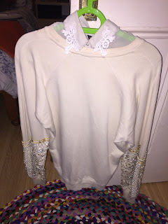
The pastel colours in these clothes have been inspired by the colours of the clothes in the Chanel editorial that are on the spectrum of pinks, whites and purples. The detailed collar that I want to include is an allusion to the use of jewellery in the Chanel catwalk, and means that there is an element of intricacy without using jewellery in the shoot as the Chanel editorial does not include this. I also think that the jumper and skirt combination is a method of combining feminine and masculine shapes and combinations that are featured in the above photos. Moreover, the pink kicker shoes have a small platform that are unconventional of heels that would be seen in a stereotypically feminine shoot. 

I have been able to borrow items that are similar to those of my moodboard from a friend, and I think that they are a perfect match to what I intended:


My idea for makeup was a graphic liner look, inspired by the black smokey eye makeup featured in the Chanel editorial, with the connotations of independence and rebellion. This is what inspired me from the editorial:


However I feel that this kind of look is too strong for the pastel coloured clothes that I am having in this shoot, as the clothes that this model is wearing are geometric and very bold. Therefore I feel that a graphic liner look will compliment the clothes without overshadowing them. I have complied some images that were my inspiration:


Either blue or black will be appropriate, as black gives the image of rebellion, and blue is on trend. When considering the styling, I believe that black would suit the clothes more as blue might clash. This eyeliner look is a juxtaposition to the feminine, vintage connotations of the outfit that my model will be wearing as it is a modern take on the famous 60's eyeliner look. Moreover, it provides an angular, neat look that lessens the casualness of the jumper and shoes that will be part of the look. After this I will include face charts with my makeup ideas for this graphic liner look. I know that I want the skin to look as natural as it does in Chanel's editorials, as this gives the impression that the model is in a rush somewhere, or simply doesn't care what she looks like and does not need to please other people.

My face chart ideas:


Having learned how to create chignons in class, I believe that a messy version would be fitting for this look. The hair in the Chanel editorials are left natural:


However, my models' hair is of a straight texture and I don't think that this would be as interesting as having afro or curly hair. Therefore I feel that a messy hairstyle would conform to this theme that the editorial has: carelessness, rebellion and adventurousness. The bun however still has this feminine look, but the messiness shows disruption and it suitable for the length and consistency of my model's hair. It means that the collar will not be covered by the hair as my model's hair is longer than shoulder length, and so creating this hairstyle has needed to encompass practicality and function as well as aesthetics.